Planning Blog: Title Design
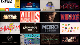
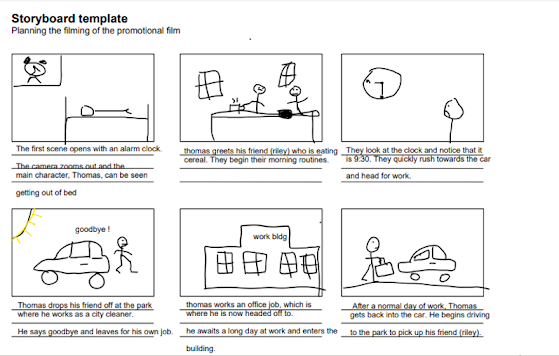
Hello again, everyone! Last time on our blog, we made a blueprint for our storyboard. The blueprint was a typed-out version of our vision for our storyboard. Now, we will be thinking about title design for our short film. Going into this, we knew that we were trying to mainly follow the thriller genre, with a hint of mystery and drama. As a reminder, our pitch is about a guy that lives with his best friend. He and his friend are very close, they do everything together, however, his friend isn't actually real and it is only a hallucination. In order to follow these parameters, we first needed to follow the thriller genre. Thanks to our extensive research on the genre, we were able to take reference and inspiration from the movies and titles we had studied. We knew that our title needed to be suspenseful and give a little bit of insight as to what our story would be about, with an 'Easter egg' as to the plot of the story, which only could be understood by people who already know the twist of the story. The twist of the story is that the best friend is not a real person. This could be illustrated in the title by putting a crack in the title sequence. In the opening sequence, we could have a random quirk such as random flashes of light. This was seen in 'Fight Club' when a random man appears 3 times as a sudden flash. Beyond this, we discussed color. For the color of our movie's title, we would probably be going with a plain black & white. We had other ideas for our title, but they were still up for discussion.


Comments
Post a Comment